Carr Gomm
Carr Gomm is a prominent Scottish social care and community development charity, dedicated to supporting around 2000 individuals across Scotland in achieving safe and fulfilling lives. My responsibilities included: competitive analysis, protype, visual design, usability testing.
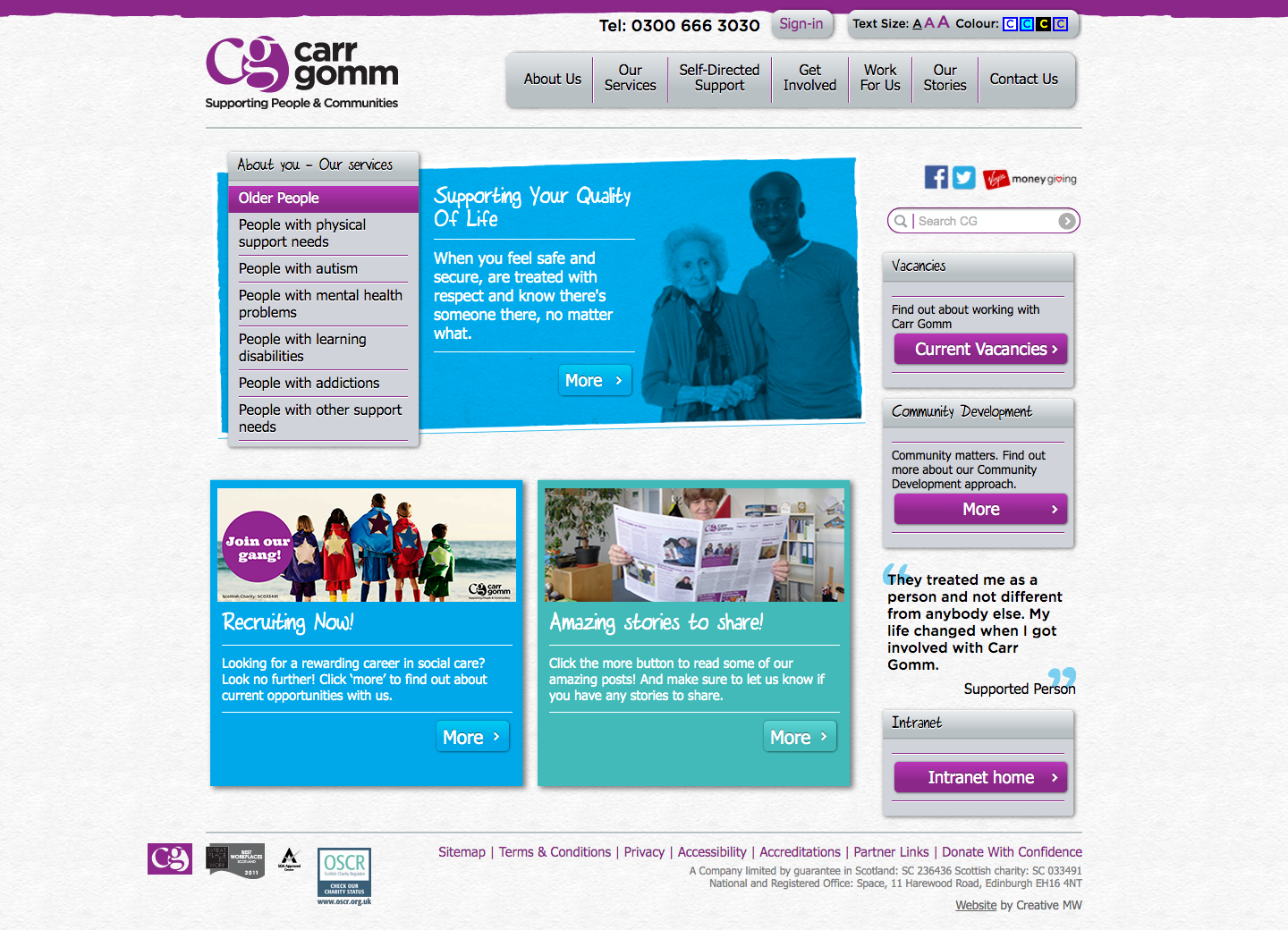
Before

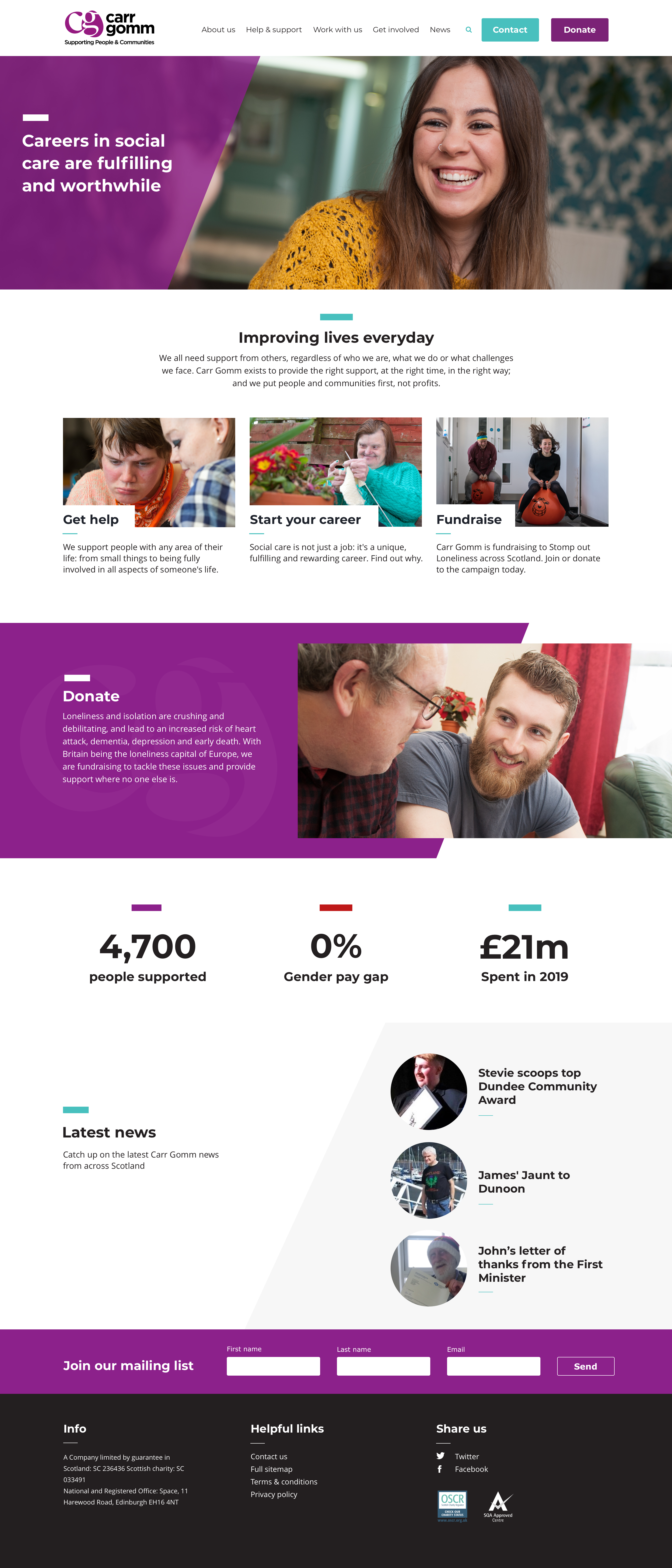
After

Research and Analysis
Competitive Analysis
Conducted a comprehensive analysis of competitor websites in the social care and charity sector. Studied their design, user experience, and content strategies to identify areas of improvement and opportunities for differentiation.
User Research
Gathered insights through user surveys, interviews, and feedback to understand the needs, goals, and pain points of Carr Gomm's target audience, including individuals seeking support and potential donors.
Objectives
- Improve accessibility and usability to ensure inclusivity.
- Simplify the navigation and content structure for easy exploration.
- Enhance visual design to align with Carr Gomm's values and promote emotional connection.
- Optimize the website for various devices, including desktop, tablets, and mobile phones.
- Increase conversions and donations through clear calls to action and storytelling.
Prototypes
Developed wireframes and interactive prototypes to visualize the new website structure and user flows. Iterated on the design based on feedback from stakeholders and user testing.
Usability Testing
Conducted usability testing sessions with representative users to gather feedback on the redesigned website. Identified pain points, usability issues, and opportunities for improvement. Made iterative design adjustments based on user insights.
Results and Impact
Increased Engagement and Support
The redesigned Carr Gomm website offers an enhanced user experience with simplified navigation, compelling visual design, and easy access to information. Users can easily explore the charity's work, services, and opportunities for engagement, resulting in increased engagement and support.
Improved Conversion Rates
The redesigned website's clear calls to action and streamlined donation process have led to improved conversion rates. Users find it easier to donate and contribute to Carr Gomm's cause, resulting in increased support and fundraising success.
Positive User Feedback
User feedback on the redesigned website has been overwhelmingly positive. Users appreciate the improved user experience, intuitive navigation, and visually appealing design. The website effectively communicates Carr Gomm's mission and encourages users to get involved.
Conclusion
The redesign of the Carr Gomm website focused on enhancing the user experience, improving accessibility, and increasing engagement and support. By implementing user-centered design principles, optimizing the website for various devices, and creating a visually compelling and informative interface, the redesigned website successfully showcases Carr Gomm's work and encourages users to contribute to the charity's cause.