Cadbury
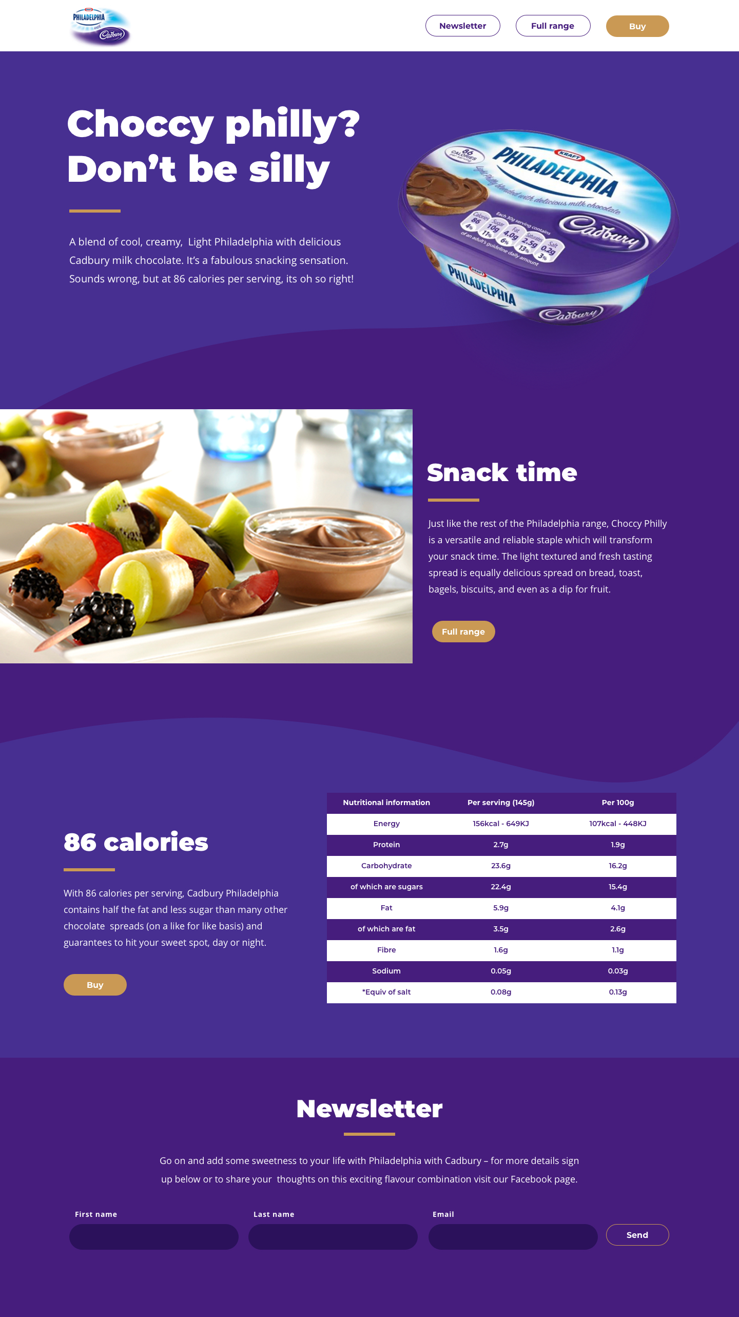
Designed and developed a microsite for the collaboration between Cadbury's and Philadelphia. The microsite served as an interactive platform to showcase the partnership, promote the new product, and engage users.
My responsibilities included: Design, Frontend developer

UI Design
Branding: Incorporate the colors, typography, and visual elements of both brands to establish a consistent and recognizable identity throughout the microsite. Use Cadbury's iconic purple color in strategic places to reinforce brand recognition.
Utilize high-quality visuals to entice users and create a desire to explore the microsite further.
Ensure that the microsite is responsive across various devices and screen sizes. The design adapts seamlessly to different resolutions, providing an optimal user experience on desktops, tablets, and smartphones.
Frontend Development
Implement a clean and semantic HTML structure, ensuring accessibility and compatibility across different browsers. Used CSS to style the site and ensure a responsive layout.
Optimize the microsite's performance by minimizing file sizes, compressing images, and leveraging caching techniques.
Test the microsite across various browsers and devices to ensure consistent rendering and functionality. Address any compatibility issues and make necessary adjustments to provide a seamless experience for all users.
SEO Best Practices: Implement proper semantic markup, meta tags, and structured data to optimize the microsite for search engines. Pay attention to page load speed, URL structure, and other SEO factors to improve visibility and organic discoverability.