Australian Retirement Trust dashboard
Australian Retirement Trust (ART) is an Australian superannuation fund. The goal of the redesign is to enhance the user experience, improve accessibility, and provide users with a clear and intuitive interface to manage their retirement savings effectively.
My responsibilities included: Research, visual design, usability testing.
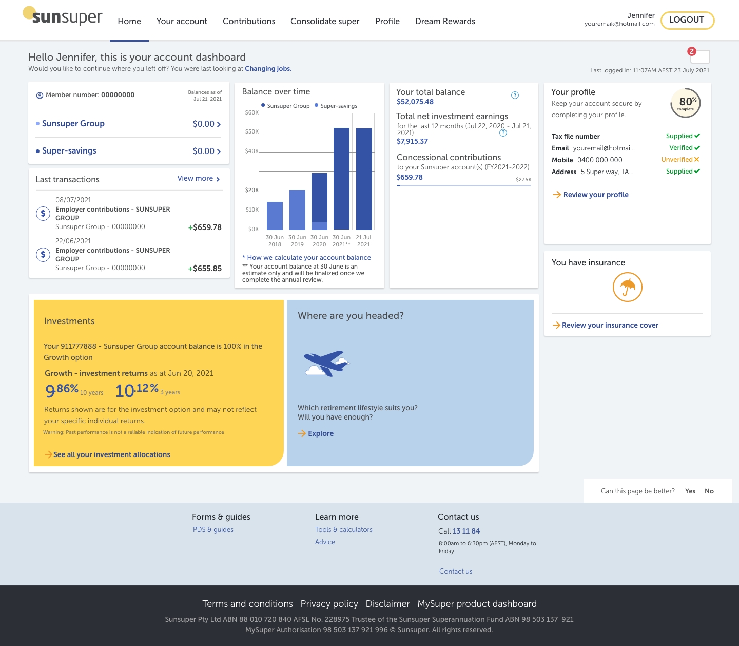
Before

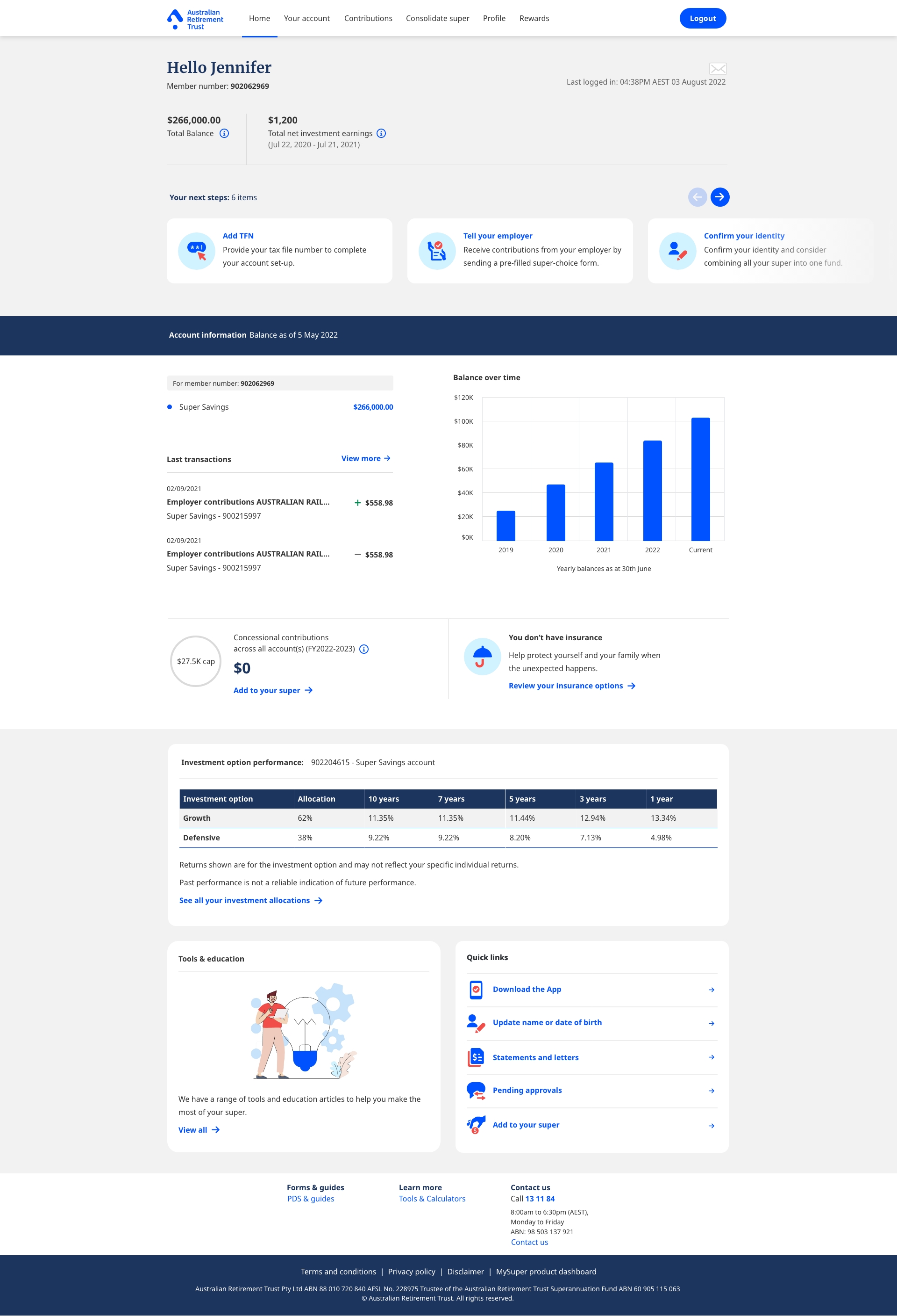
After

Research and Analysis
To kick off the redesign process, extensive user research was conducted to gain a deep understanding of ART's target users, their needs, and pain points. The research methods employed include user interviews, surveys, and competitive analysis of other superannuation funds' dashboards.
Key findings from the research phase:
- Users found the existing dashboard overwhelming and difficult to navigate, resulting in frustration and confusion.
- Many users lacked clarity on how their retirement savings were performing and desired personalized insights and recommendations.
- Accessibility was a concern for some users, particularly those with visual impairments or older age groups.
- Users expressed a preference for a simplified and intuitive interface that displayed critical information upfront.
Objectives
- Simplify the layout and improve the overall usability of the dashboard.
- Improve the visibility of the personalized insights and recommendations to help users make informed decisions.
- Enhance accessibility to ensure inclusivity for all users.
- Maintain a clean and intuitive interface that prioritizes essential information.
Design
Once the wireframes were refined, interactive prototypes were developed to simulate user interactions and test the proposed design changes.

Key findings from usability testing
- Users found the redesigned navigation significantly easier to use, resulting in quicker access to desired information.
- Personalized insights and recommendations were highly valued by users, as they provided actionable information for retirement planning.
- The accessibility improvements, such as increased font size and high color contrast, positively impacted users with visual impairments.
- Users appreciated the clean and intuitive interface, as it reduced cognitive load and allowed them to focus on essential information.
Iterative Design Refinements
The feedback from usability testing was carefully analyzed, and the design was iteratively refined based on the findings. This process included further wireframing, prototyping, and testing cycles to address any remaining pain points and ensure a seamless user experience.
Conclusion
The redesign of the ART dashboard aimed to enhance the user experience and provide users with a clear and intuitive interface to manage their retirement savings effectively. Through user research, wireframing, prototyping, and usability testing, the design objectives were achieved, resulting in improved findability, clearer personalized insights, enhanced accessibility, and a clean interface. The final design solution reflects the needs and preferences of the target audience, creating a more engaging and user-friendly experience for ART's superannuation fund members.